

Marlowe Churchill Design
Design Gallery

This book was designed to showcase the evolution of bridal fashion from ancient times up to our current time. The book was created to educate fashion designers and wedding planners on the details of bridal fashion, so they are more knowledgeable sources for clients. Within a 6 month period, I designed this entire book (564 pages) solo. See it on Amazon.com.

This Lexus ad was designed for Comstock's Magazine and Sacramento Magazine to showcase the new Lexus model.

This design package was for a bride and groom with a Turkish heritage and a love for water color and rustic/country inspired design.
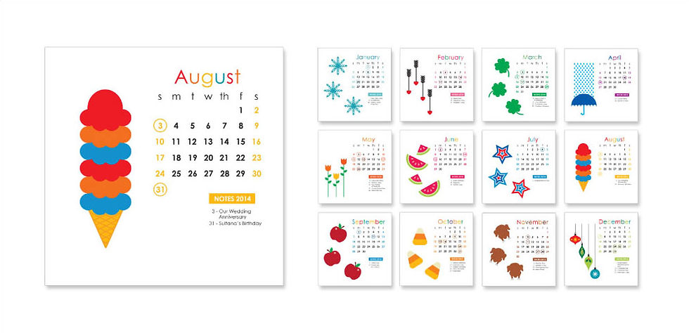
In this fully illustrated 2014 calendar, there are illustrations of objects representing the chosen month in a fun way. Each month has important dates highlighted, along with a notes section for the user to write other notes.

This insurance infographic informs readers on how age, sex, and marital status will change their given coverage rate with three of the major leading insurance carriers.

This poster was designed for the opening night of Phantom of the Opera. It was designed in the art nouveau style, which was also the time period when the original play opened in theaters.


These are sample designs of pages from Lego's annual report given out to shareholders. The design is a fun take on their tagline "Play On." Each selection has a corresponding illustrated item built out of Lego pieces, this design helps break up all of the informational parts so the reader can stay interested in the annual report reviewing the year.


This wedding invitation set design was baroque inspired. The bride loved the baroque look and wanted that reflected in a mint colored design.

These materials were for increasing awareness to businesses on the dangers of not having a business covered for unforeseen problems in the future.

This three-piece set of forms make-up the health history form used by local dentists. The form has detailed questions to help the doctor understand the history of the patient better before working on any procedures. The form needed to be designed to fit on no more than two sheets (front and back allowed) of paper.

This calendar design was created for Joe's Stationery Company. As a low-budget project, this client needed to have the project stick to two spot-colors. Plus the design called for dots to represent halftones, as this company does printing jobs as well.

This is a smart kids-centered design made to encourage families to visit the Monterey Bay Aquarium.